
50K+
Workers on platform
60%
Faster project creation
921K
QR scans in 2025
1.6M
App sessions in 2025
A safety tool that made safety harder
Site managers and contractors relied on HazardCo every day to stay compliant, manage hazards, and keep people safe. But the platform was fighting them at every step.
What was broken
- Long, repetitive forms - SSSP and project forms required filling out extensive fields every time, even when information was similar.
- Re-entering team and site details - Users had to input site supervisors, team members, and site-specific information repeatedly.
- Fragmented selection - Workflows and project type seecltions were fragmented across disconnected pages, forcing users to hunt for what they needed
- No draft or autosave - Users could not save incomplete forms, increasing risk of errors and wasted time.
- Poor interface for repetitive actions - No defaults, suggestions, or recent selections for builds, hazards, or project details, making routine tasks slow and error-prone.
Why it mattered
- Time-consuming workflow - Users spent excessive time completing forms instead of focusing on actual site safety.
- Risk of errors - Re-entering the same data manually increased mistakes that could compromise safety compliance.
- Automatically recommend - Default project type based on questionnaire responses, while advising the user to select or upgrade the project type for better features.
- Low adoption - Poor UX and friction discouraged site managers and contractors from using the platform.
- Reduced clarity under pressure - Busy site managers lacked easy access to defaults, suggestions, or recent selections, creating cognitive overload in safety-critical situations.
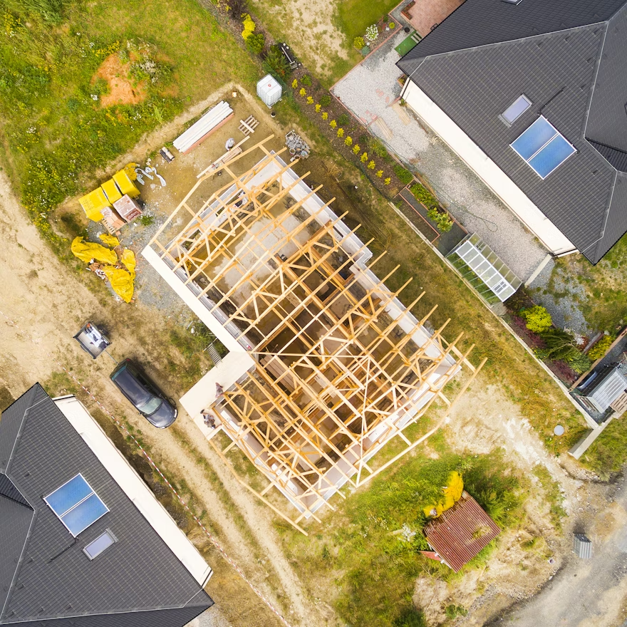
Designing for the field, not the office
Thousands of workers across Australia, New Zealand and the UK. Busy site managers, real compliance consequences, and a platform that needed to work in the field, not just on a desk.
I approached this as a systems problem, how information flows between roles, platforms, and moments in the construction day.
End-to-end, from research to release
Research
User interviews, usability testing, surveys with site managers and contractors
Architecture
IA restructure, journey mapping, interaction flow design
Prototyping
High-fidelity Figma prototypes with interactive states across all platforms
Test & Ship
Usability testing with real site managers, iteration, design system build
From information overload to actionable clarity
Restructured into three zones that mirror how site managers think.
01. Actions Needed Now
Critical tasks and pending approvals surfaced first. No more hunting.
02. Project Status Overview
Active projects, contractor compliance, site safety — at a glance.
03. Recent Activity
What happened while the manager was away. Scan without reading.
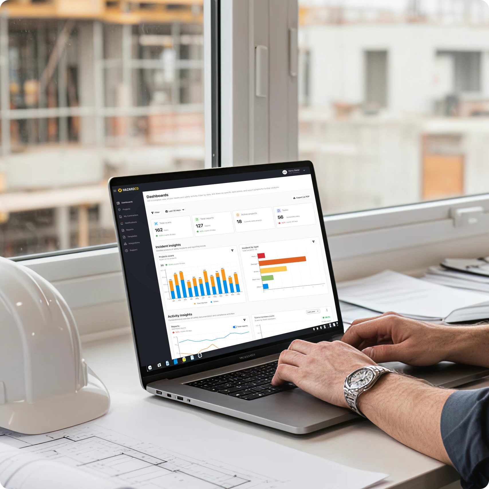
Dashboard redesigned will be placing here
assets/img/hazardco/hazardco-dashboard.png
Export full-width desktop dashboard from Figma at 2× resolution
Project Ordering — Before & After
The single most important user journey — where revenue is generated, compliance begins, and first impressions are formed.
Before ✗
- Single long-form page — all fields at once
- No progress indicator
- No draft saving — close the tab, lose everything
- Re-enter data on every new project
- High drop-off rate mid-flow
After ✓
- Structured 4-step flow with clear progress
- Summary page before submission
- Auto-save draft at every step
- Smart defaults pre-fill returning users
- Reduced cognitive load throughout
Project ordering — 4-step flow
assets/img/hazardco/project-ordering.jpeg
Export the 4-step Figma flow side-by-side at 2× resolution
Project Details
Smart defaults + suggestive dropdowns.
Project Type
Selection pills replace long dropdowns.
Project H&S
Import from previous projects in seconds.
Submit Order
Full summary. Edit-in-place. Submit with confidence.
All contractor data. One page.
Complete visibility into every contractor's status, documents, and compliance — without leaving the page.
Pre-qualification
Instantly see who has completed requirements.
Documents
All compliance docs in one consolidated view.
Ratings
Performance ratings visible at a glance.
Quick View Panel
Slide-over to view & edit without leaving the list.
Contractor management + Quick View panel
assets/img/hazardco/hazardco-contractor.png
Export the contractor list with slide-over panel open from Figma
Everything without leaving the page
Modal-based architecture keeps site managers in context while taking action — critical in safety workflows where context switching costs time.
People on site — project overview
assets/img/hazardco/people-on-site.jpeg
Export the project overview screen with worker list and an open modal
Mark as Left Site
Manually update if a worker forgets to scan out.
White Card Details
Verify safety training directly from the people list.
Induction History
Download full induction record for compliance audits.
Induction Details
Review hazards and site rules a worker acknowledged.
User Profile
Certifications, contact details, and site history in one tap.
Why modals?
Act on an issue, then return exactly where you were.
Built for the field
Large touch targets, tile navigation, offline-first — designed for gloved hands, bright sunlight, and construction site connectivity.
Worker scanning QR at site entrance
assets/img/hazardco/scan-board-entrance.jpeg
Real or staged photo of a worker scanning the HazardCo QR board
One scan. Signed in.
QR scan in bottom navigation for instant access. After scanning, site details and induction display immediately. Workers tracked and compliant in under 10 seconds.
Risk assessment in seconds
Consequence and likelihood sliders for quick risk evaluation. Pre-populated controls based on hazard type — workers select, not type. Colour-coded severity for instant comprehension.
Risk controls — mobile app
assets/img/hazardco/risk-controls-mobile.jpeg
Export the risk slider + controls screen from Figma mobile frames
Full mobile app screen spread
assets/img/hazardco/hazardco-mobile-screens.png
Export 5–6 key mobile screens side-by-side on a dark or neutral background
Built for scale and consistency
A unified component library across web and mobile. Buttons, forms, cards, modals — consistent spacing, colour, and interaction patterns across every platform.
Component Library
Shared components with versioning and backward compatibility across releases.
Colour System
Trust Blue · Safety Orange · Success Green · Slate Dark — each with a deliberate semantic role.
Design system — component library
assets/img/hazardco/hazardco-design-system.png
Export the Figma component library page showing colours, type, and UI components
Final screens
Full-width final screens spread — web + mobile
assets/img/hazardco/hazardco-screens.png
Compose a hero mockup in Figma: dashboard on MacBook + key mobile screens on iPhone, export at 2× on a dark or brand-coloured background
Results that mattered
Reduced support queries
After launch, ordering support queries dropped significantly. The flow was self-explanatory.
Faster onboarding
New users completed their first project order without training. The step-based flow guided them.
Improved compliance
Easier access to hazard boards and induction records helped sites maintain better standards.
Manager confidence
Site managers reported feeling more in control. Nothing was being missed.
Design elevated
Design moved from support function to strategic driver. The system became a competitive advantage.
"The new system just makes sense. I can find everything without calling support."
— Site Manager, HazardCo user feedbackWhat I learned
Safety context changes everything
A confusing dropdown on a safety-critical platform isn't just annoying — it can delay a hazard report.
Systems thinking over screen thinking
The biggest impact came from rethinking information flow between screens — not redesigning individual pages.
Business awareness is a design skill
Understanding revenue, churn, and LTV makes you a better designer.
Mobile must consider the field
Gloved hands, bright sunlight, poor connectivity — standard mobile patterns often don't apply.
Collaboration scales impact
Working with PMs, engineers, and support gave insights I'd never find in user research alone.
Maturity through ownership
Four years on one product. Prioritise, ship, learn, iterate — that cycle is where design maturity lives.