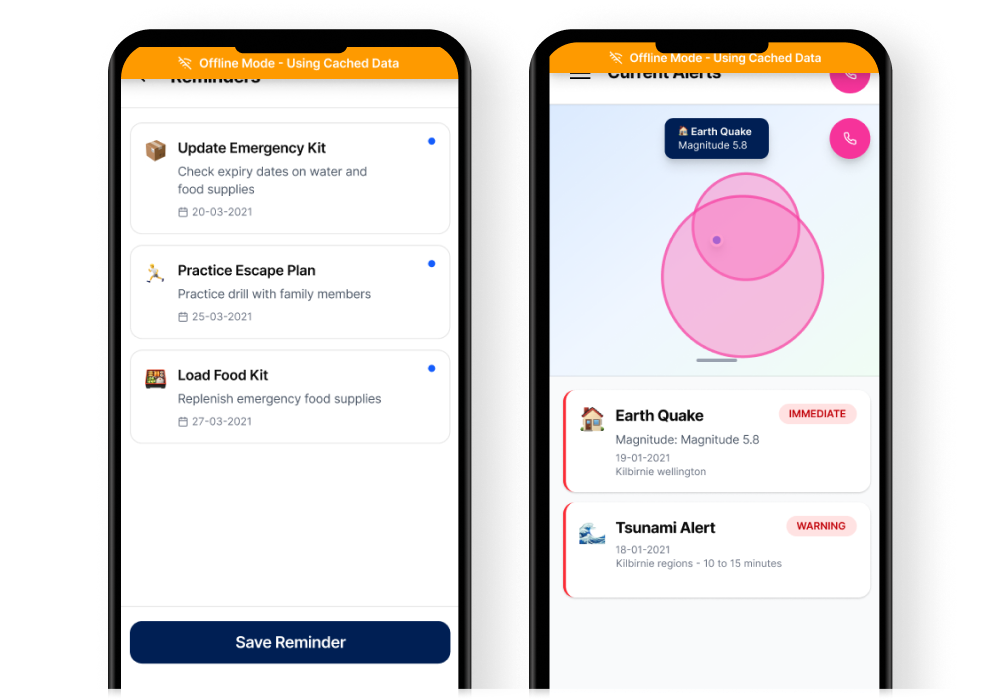
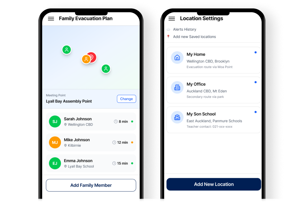
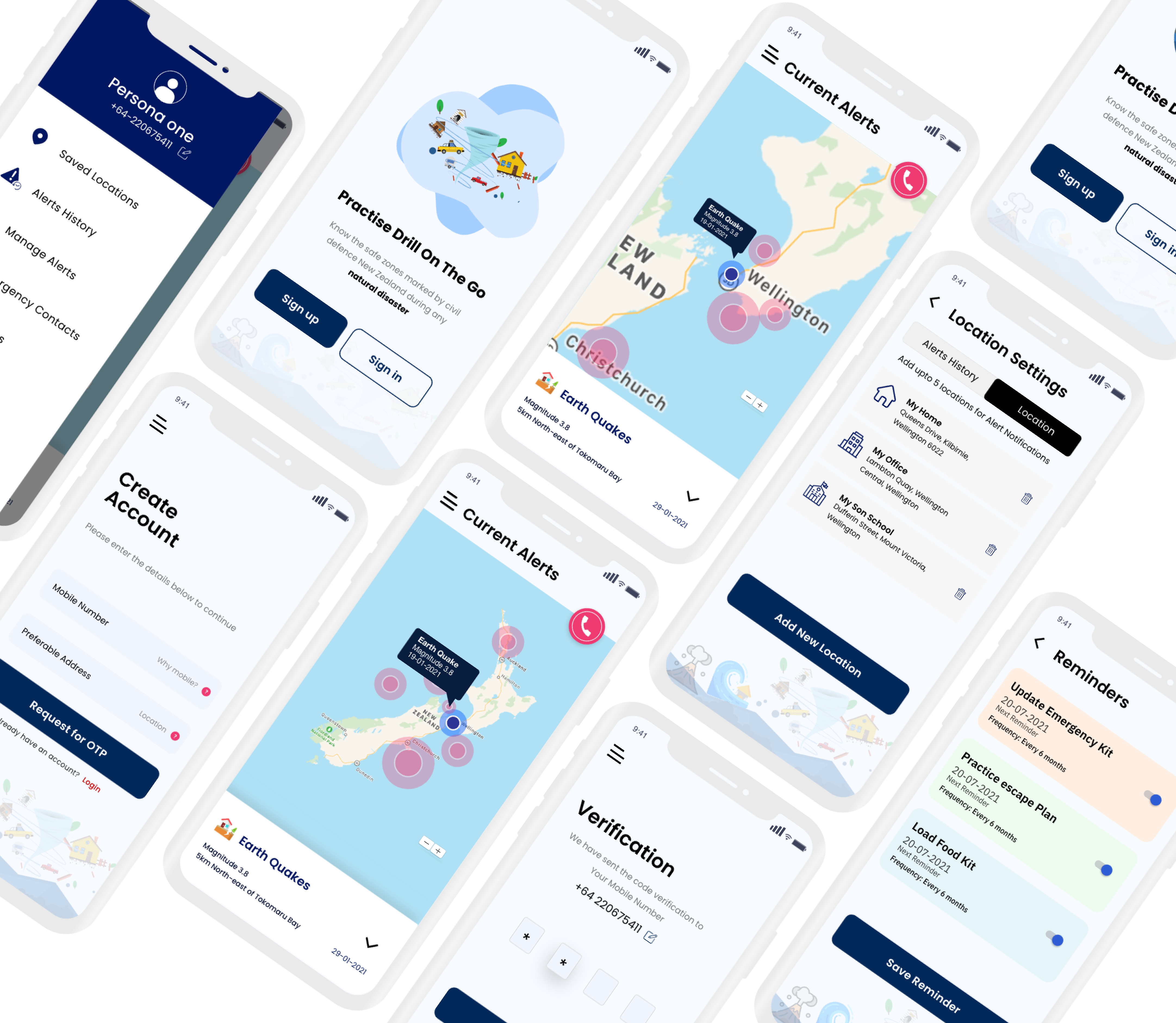
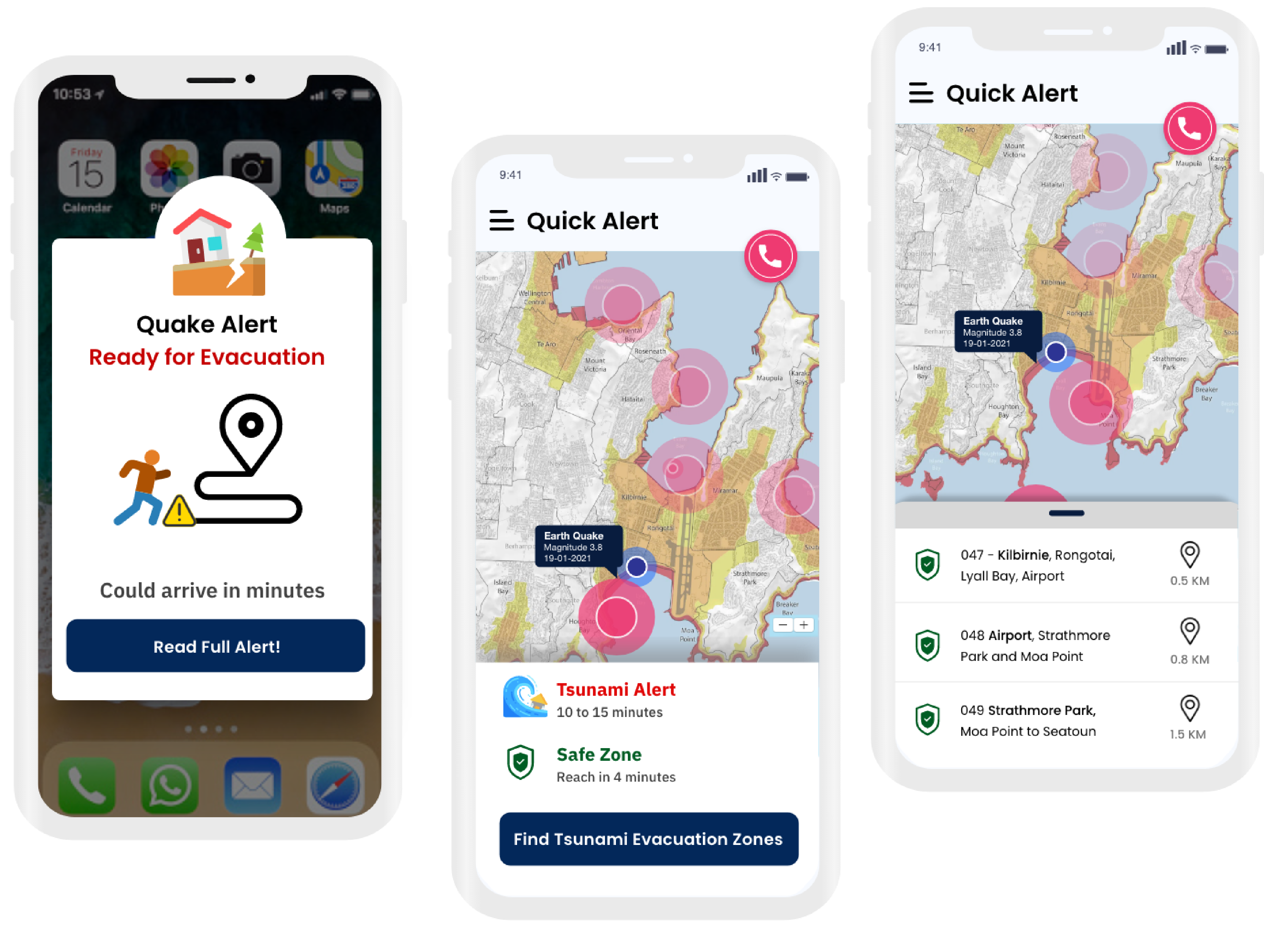
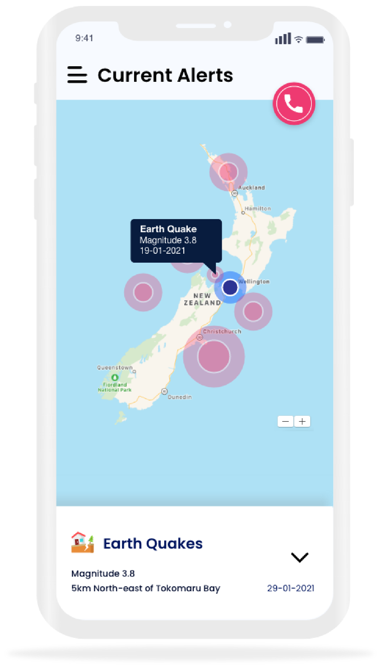
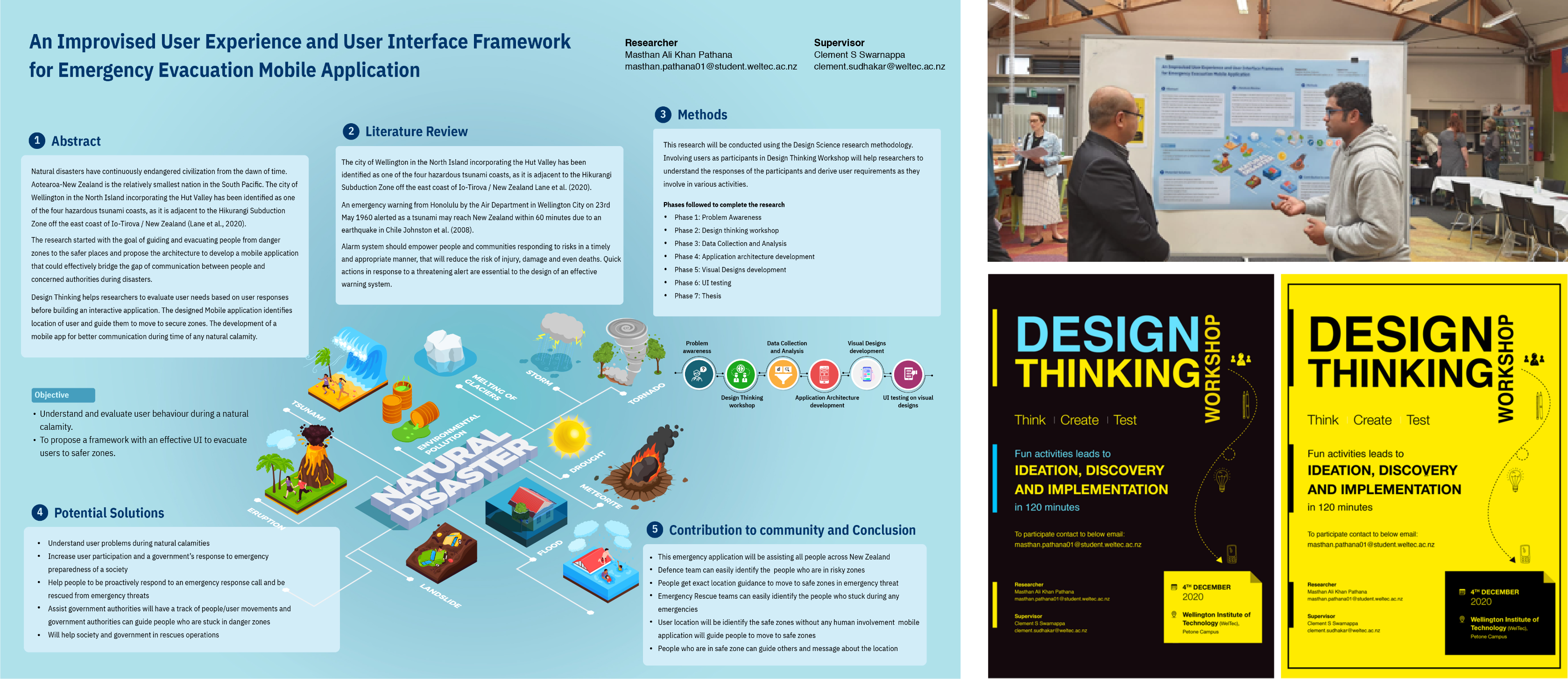
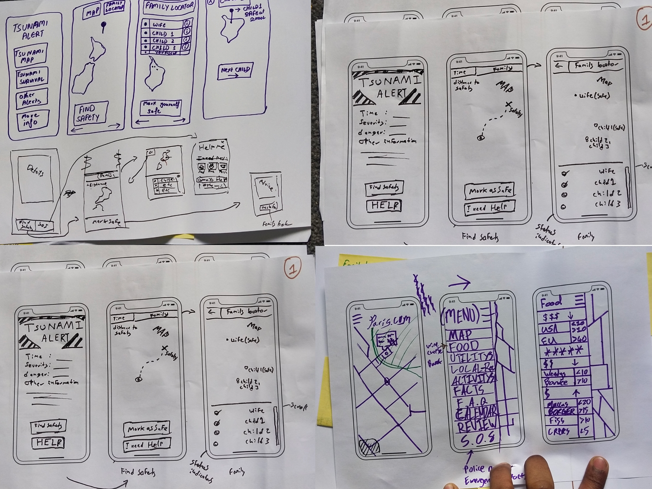
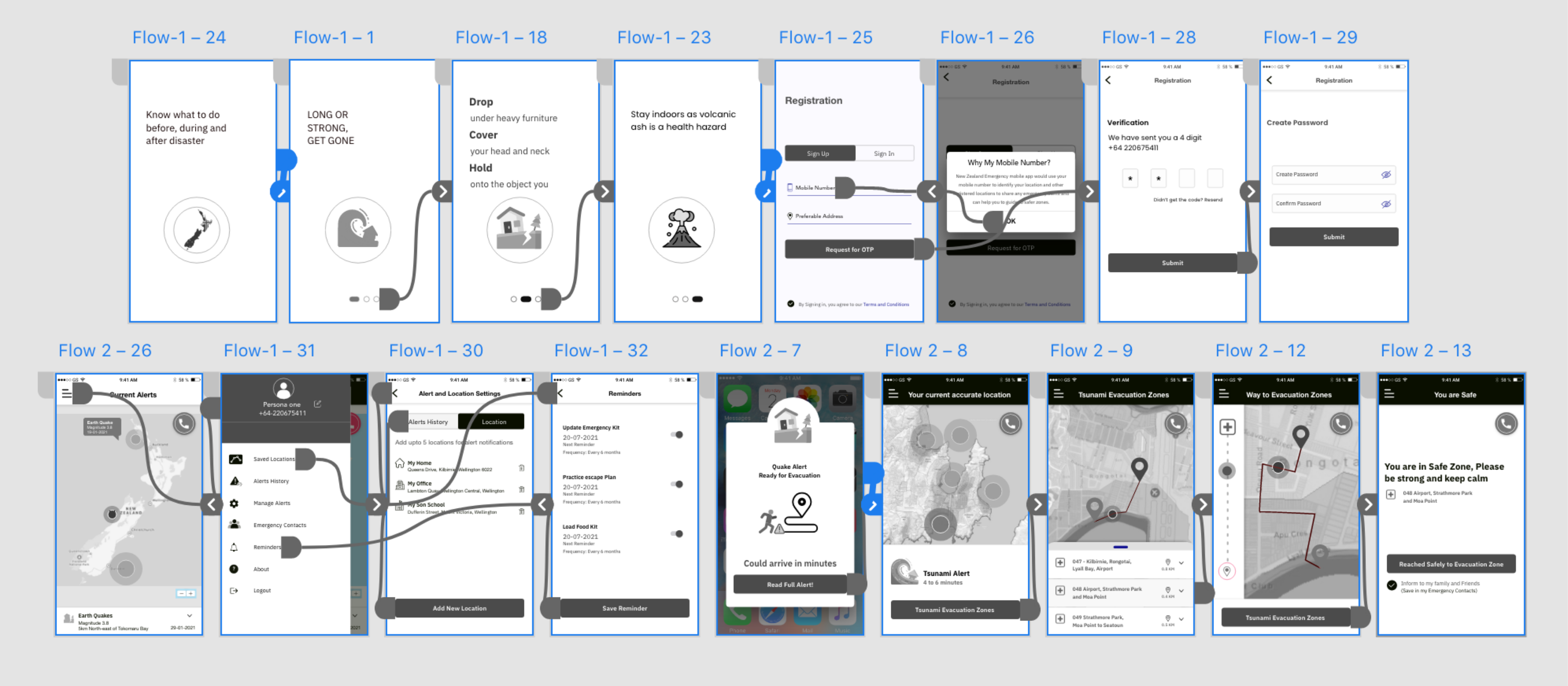
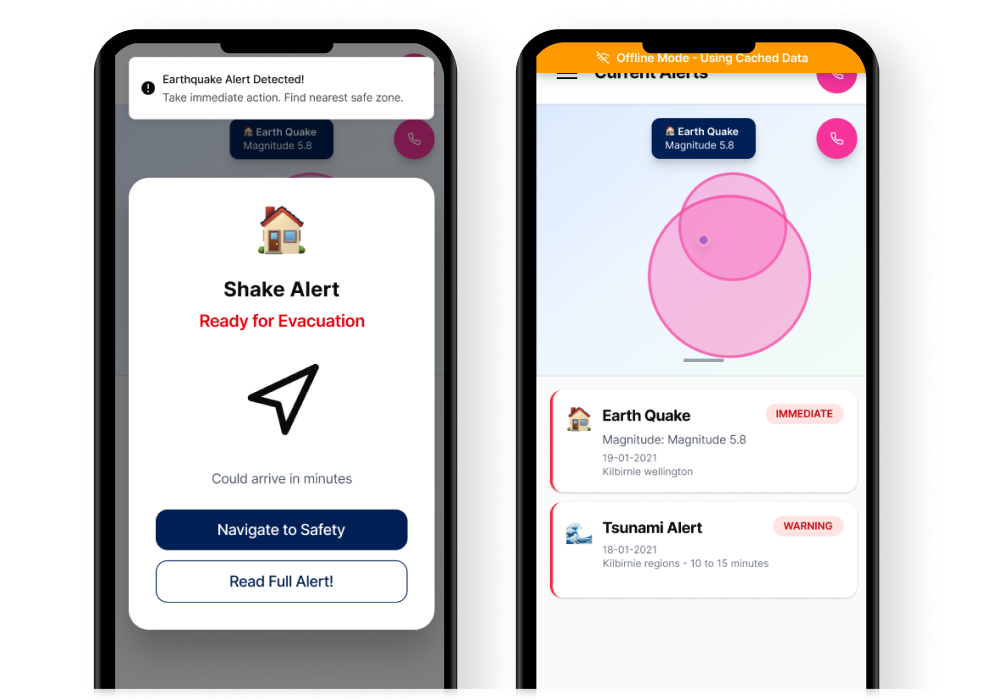
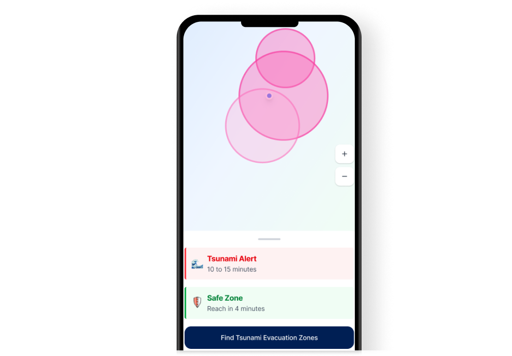
New Zealand sits on the Pacific Ring of Fire. Earthquakes, tsunamis, volcanic eruptions, and floods are not hypothetical they're recurring events. I designed a mobile app that helps people find the safest route to evacuation points, in real-time, when panic is at its peak.
Lead UX/UI Designer
6 months
iOS & Android
When a natural disaster strikes, people often have only minutes — sometimes seconds — to decide whether to evacuate and move to safety. In these critical moments, they need information that is clear, reliable, and easy to act on.
Instead, the information available is often fragmented and difficult to interpret. Alerts may arrive on time, but the guidance that follows can be unclear, too generic, or not tailored to individual circumstances. For tourists, newcomers, or commuters unfamiliar with local areas, this lack of clarity increases confusion and delays critical decisions.
The core challenge: how do you design an interface that someone can use under extreme stress, with shaking hands, in poor lighting, possibly while running?
I began by understanding the real scenarios. I studied New Zealand's Civil Defence emergency management guidelines, analysed how people behaved during the 2011 Christchurch earthquake and the 2016 Kaikoura event, and interviewed residents in Wellington a city that sits directly on a fault line.
People don't read instructions during emergencies. They scan for visual cues. The UI needed to communicate through color, iconography, and spatial hierarchy not paragraphs.
Families need to coordinate. Parents need to know their children's school evacuation plan. A shared family evacuation plan feature became critical.
Offline capability isn't a feature it's the feature. Cell towers are among the first infrastructure to fail. The app had to cache evacuation maps and routes locally.
Three primary user archetypes guided every design decision.
Uses public transport daily. Unfamiliar with evacuation routes outside their neighbourhood. Needs real-time, GPS-guided routing to the nearest safe point from wherever they are.
First instinct during an emergency is to reach their children. Needs visibility into school evacuation status, family member locations, and the ability to set meeting points.
No local knowledge. Doesn't know where to go or what the alert system sounds like. Needs the simplest possible interface with clear visual directions and multilingual support.
I followed a user-centred design process, iterating through low-fidelity wireframes to high-fidelity prototypes, with usability testing at each stage.
An invitation poster was created for research (including date, time and duration) to invite participants from various thematic information and display it at the WelTec & Whitireia Symposium to connect with a large audience and target users to participate in the design thinking workshop.
I had used Crazy 8’s concept during ideation stage. Participants had came up with 8 different ideas in eight minutes to build the mobile application.
In Ideation activity we had gone through across the board to contribute and pitch ideas, rank them and eventually - select the best of them for inclusion into the product.
This ensured that the user’s voice was heard, and I saw in how the product would be developed.
Push notifications triggered by Civil Defence data. The alert screen uses color-coded severity levels (red for immediate danger, amber for warning, blue for advisory) with large, readable text and a single primary action: "Navigate to Safety".
The design deliberately limits choices during a crisis. When an earthquake alert fires, you don't need a menu you need one button.
The map view shows the user's current location, nearby evacuation points, and the fastest walking route to safety. Routes update in real-time based on reported road closures, flooding, and structural damage.
I designed the map for maximum clarity: high-contrast route lines, oversized destination markers, and voice-guided turn-by-turn navigation so users can keep the phone in their pocket while moving.
The app pre-downloads evacuation maps, assembly point data, and emergency contact information for the user's region. When connectivity drops, the app switches seamlessly to cached data with no user action required.
A subtle indicator shows online/offline status, but the core experience remains identical. Users shouldn't have to think about whether they have signal.
Users can create a family group, set designated meeting points, and share their real-time location during an emergency. Each family member sees the others on the map, with estimated walking time to the shared meeting point.
During usability testing, this was the feature that generated the strongest emotional response. Parents said it addressed their deepest anxiety during disaster scenarios.
All critical actions are reachable with a thumb on a standard-sized phone. The navigation button sits at the bottom centre. Alert dismissal uses a swipe gesture, not a small X. This matters when hands are shaking.
Red, amber, and blue aren't decorative they're functional. Each color maps to a specific threat level across the entire app. Users learn the system once and can parse any screen in under two seconds.
During an active alert, the app shows only what matters: direction, distance, and estimated time. Detailed information (shelter capacity, supply availability) is available but tucked behind a secondary action.
Alerts trigger haptic vibration patterns distinct from regular notifications. Arrival at an evacuation point triggers a confirmation vibration. For visually impaired users, the entire flow is voice-navigable.
Designing for extreme context is humbling. You can't rely on user patience, ideal lighting, or steady hands. Every assumption about "normal" use breaks down. This project taught me that the best interface is the one that disappears when it matters most it just works, without thinking.
Accessibility isn't an add-on. When I designed for people using the app during an earthquake with large tap targets, high contrast, voice navigation, and haptic feedback I was designing for everyone. The accessibility features improved the experience for all users, not just those with disabilities.
What I'd do differently: I'd push harder for real-world stress testing. Lab usability tests are useful, but simulating actual panic is nearly impossible. I'd advocate for field testing during Civil Defence drills, with real participants in real locations, to validate the design under conditions closer to reality.